Appearance
Customize how AgentOne looks, including theme, colors, font, input style, and sidebar layout.
The Appearance section in Settings controls the visual presentation of the entire app. Changes take effect immediately - there is no save button needed.
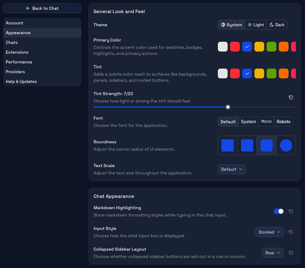
General Look and Feel
Theme
Choose between Light, Dark, or your system's default (System). The system option follows your OS-level dark/light mode preference and switches automatically when you change it.
Primary Color
Sets the accent color used for highlights, buttons, and active states throughout the app. Several preset colors are available, plus the ability to enter a custom hex value.
Tint
Adds a subtle color tint to the app's background surfaces. Useful when you want a warmer or cooler overall feel without changing the primary color.
Tint Strength
Controls how strong the tint effect is, from barely visible to quite pronounced. Set it to zero to remove the tint entirely.
Font
Choose from several bundled font options for the app's text. The font affects the entire interface, not just the chat area.
Roundness
Adjusts the border radius of UI elements from sharp corners to very rounded ones. A matter of personal preference.
Text Scale
Scales the base font size up or down. Useful for accessibility or when running AgentOne on a high-density display.
Chat Background
Add a background image behind the main chat area. Pick from built-in presets or use your own image for a more personalized workspace.
Preset Images
Choose from several built-in images: Abstract, Morning Mist, Night Sky, Island, Aurora, Valley, Forest, Ocean, Mountain, and Sunset. You can also select None to remove the background entirely.
Custom Images
Click Add Custom to select an image from your computer. Supported formats include PNG, JPG, JPEG, WebP, GIF, BMP, and AVIF. Custom images are stored locally and can be removed from the custom list at any time.
Effects
Fine-tune how the background image appears behind your chat content:
- Opacity - controls the tint overlay strength from transparent (0%) to heavily tinted (70%).
- Blur - applies a smooth blur to the image from none (0px) up to a strong blur (20px).
- Dim - darkens the image from none (0%) to significantly dimmed (70%).
Position & Zoom
Adjust where and how the image is displayed:
- X - horizontal offset of the image from left (0%) to right (100%).
- Y - vertical offset from top (0%) to bottom (100%).
- Zoom - scales the image from its original size (100%) up to 200%.
Background Shade
When a chat is open, a semi-transparent overlay sits between the background image and the chat content to keep text readable. The Shade Opacity slider controls how visible this overlay is, from completely transparent (0%) to fully opaque (100%).
Chat Appearance
Markdown Highlighting
Controls whether code blocks in chat messages have syntax highlighting. If you chat primarily about non-code topics, turning this off can improve rendering performance on long chats.
Input Style
Two options for how the composer sits at the bottom of the chat:
- Docked - the composer is flush with the bottom edge of the window, extending the full width.
- Floating - the composer appears as a rounded panel floating above the bottom of the window, with space around it.
Collapsed Sidebar Layout
When the sidebar is collapsed, a small set of quick-access buttons remains visible. This setting controls whether they appear in a horizontal Row or a vertical Column.
Resets
Most individual appearance settings have a small reset button next to them that restores just that setting to its default value without touching the rest.
Related
- Desktop Layout - understand where the sidebar, chat area, and composer are.
- Chat Settings - markdown rendering, submit key, and streaming behavior.